HTML5 Responsive Web Design
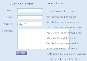
Figure 1: Resized form element
breaks table layout.
Important considerations with HTML5 are responsive web design and flexible forms. Our pages are examples of responsive web design. Try browsing through our web site and scaling any of the pages, or making the browser window bigger or smaller. The page scales to fit without imposing a strict layout on the visitor.
Responsive Web Design Problems
The responsive web design paradigm is not without its share of problems and opponents. In the process of learning JavaScript, I came across questions from developers asking how to disable certain browser features, such as the ability to resize form elements, complaining that it breaks page layouts (Figure 1). This is a very bad idea, and I'll explain why.
It is sometimes necessary for visitors to customize a page themselves to make it readable on a device, or to make up for bad page design. A necessary form might become obscured by an advertisement or table, for example, making it impossible to fill out. Old pages designed for outdated browsers may become dysfunctional and unresponsive if we don't have some way to organize the content. Ideally, we would redesign our sites to accomodate different devices, and even anticipate user customizations in our designs.
The only problem with Responsive web design is lack of understanding of the concept. Applications that claim to "design web sites" may create inflexible, easily-broken page layouts that only work on certain platforms. The solution is to learn the basics of responsive web design. It's pretty simple. Responsive web design uses variable-sized elements that scale to various devices and prevent overlapping or broken layouts on different screen sizes. That's it. Responsive web design is web design that is flexible and device-friendly.
Responsive Web Design Solutions
The following recommendations help to provide a better visitor experience:
- Use auto height and width attributes for pages and elements
- If auto is not used, Amazon recommends 300x350 for mobile websites1
- Implement Media queries in CSS
- Encloses forms in floated <div> elements
- Use "inherit" background to match website themes
- Provide methods for visitors to customize elements and themes
Firstpage and Responsive Web Design
Firstpage is a free tool we made and use to design our web sites. Firstpage creates web sites using github markdown format. It is not necessary to know HTML to use Firstpage, but it helps. Firstpage allows content creators to freely mix HTML into their creations while focusing on content instead of worrying too much about layouts and tags. Open Graph Protocol metadata tags are supported. Web sites are content-aware rich objects for the social graph. The great thing about Firstpage is it updates menus to point to new pages, and automatically creates content cross-links.
Jwin and Flexible Forms
Jwin is a new, free, slim (less than 8K) JavaScript toolkit and loader. We designed Jwin to accomodate forms and interactive elements such as this Morse Code Translator onto our pages. Jwin encloses forms in floating div elements called website "apps" or "widgets". They behave like mini Windows applications that run in the browser. Using Jwin, visitors can maximize and minimize the form windows and move them around on the page. Try it!
If your browser supports textarea scaling (Chrome does. Firefox can do it with a browser extension) clicking and drag on the bottom-right corner of the text box makes the window bigger or smaller.
Jwin apps may be included onto a page using only one line of code. In this way Jwin apps can be easily shared and distributed to other sites, leading to greater distribution, acceptance, and support. Jwin and TML incorporate flexible and responsive HTML5 web design standards supporting the future of responsive web design.
Links
 Copyright © 2025 Henry Kroll III, thenerdshow.com This web page is licensed under a Creative Commons Attribution-ShareAlike 3.0 Unported License.